FEATURED-RELATED SOFTWARE UX
'Save A Copy' in Microsoft PowerPoint
Users saving a file in PowerPoint often expect "Save A Copy" to show file destinations immediately. Instead, the interaction hides traditional file browsing behind "More Options," creating confusion, double work and unnecessary clicks.
This report will evaluate the UX issue, identify user needs, and propose an improved "Save A Copy" model that surfaces common locations immediately and collapses advanced options without requiring extra steps.
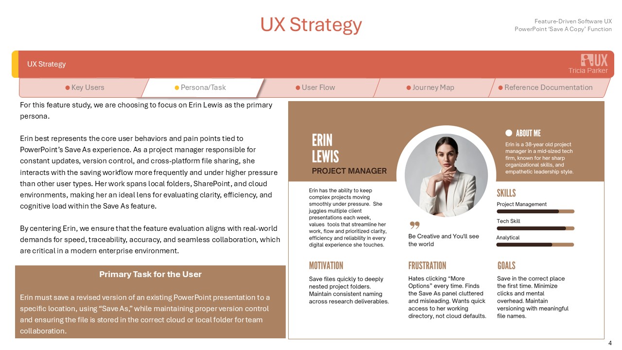
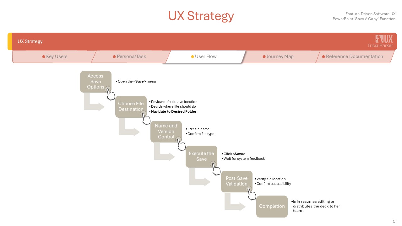
Erin Lewis, a busy project manager polishing her client briefing at the last minute, grows irritated when she clicks <Save A Copy> only to be forced into the hidden <More Options> menu just to choose a folder. She mutters under her breath as precious seconds slip away, wishing PowerPoint would simply let her pick her location up front.
UX Problem Definition
Current Behavior
When a user selects File → Save As or uses the <Ctrl>+<Shift>+<S> shortcut in PowerPoint, a side panel appears displaying preset locations such as OneDrive and recent folders. To access classic file explorer locations like Desktop, Documents, external drives, or custom paths, the user must click “More Options.” Only after this step does the standard Save dialog open, allowing full browsing of file locations.
"I get confused how to quickly save my file to a specific folder without having to step through extra steps.". ~ Erin
Problems
The hidden primary action of browsing directories conflicts with users' mental models from older Office versions, creating friction for those who often work across various drives and shared environments. This design choice increases cognitive load by failing to clearly communicate available options.
"In fast-paced client work, every extra click is time that I don't have". ~ Erin
Impact
This approach reduces efficiency for power users and causes confusion for those who use the software infrequently. Additionally, it creates an inconsistent experience across different Office applications.
"This is causing my projects to be unorganized and moving on schedule". ~ Erin
Research
Methods
In PowerPoint, users were observed saving a document.
Study Type
Length
Participants
Evaulation:
Simulated scenario
30-40 minutes
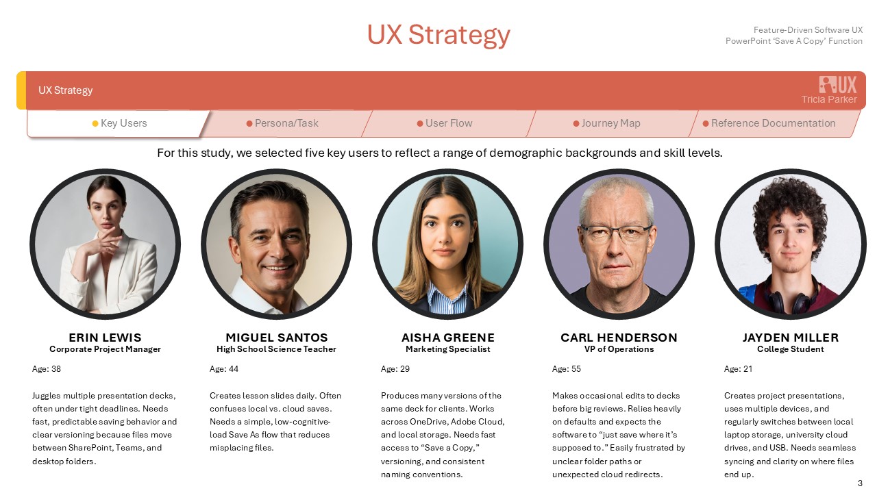
5 participants
• 2 females, 3 males
• Ages 21-55
• Technology friendly and limited-use tech
Nielsen’s 10 heuristics
Heuristic Violations Identified
Heuristic
Issue
Key Findings
80%of test users clicked <More Options> within three seconds, indicating that the default panel did not meet their needs. Many users assumed that “More Options” referred to advanced settings rather than file browsing, and they expected immediate access to their preferred file locations.
Users expected immediate access to:
- Desktop
- Last-used folder network drive
- Project folder
- “Recent folders” list was helpful but incomplete for multi-project workflows
Pain Points
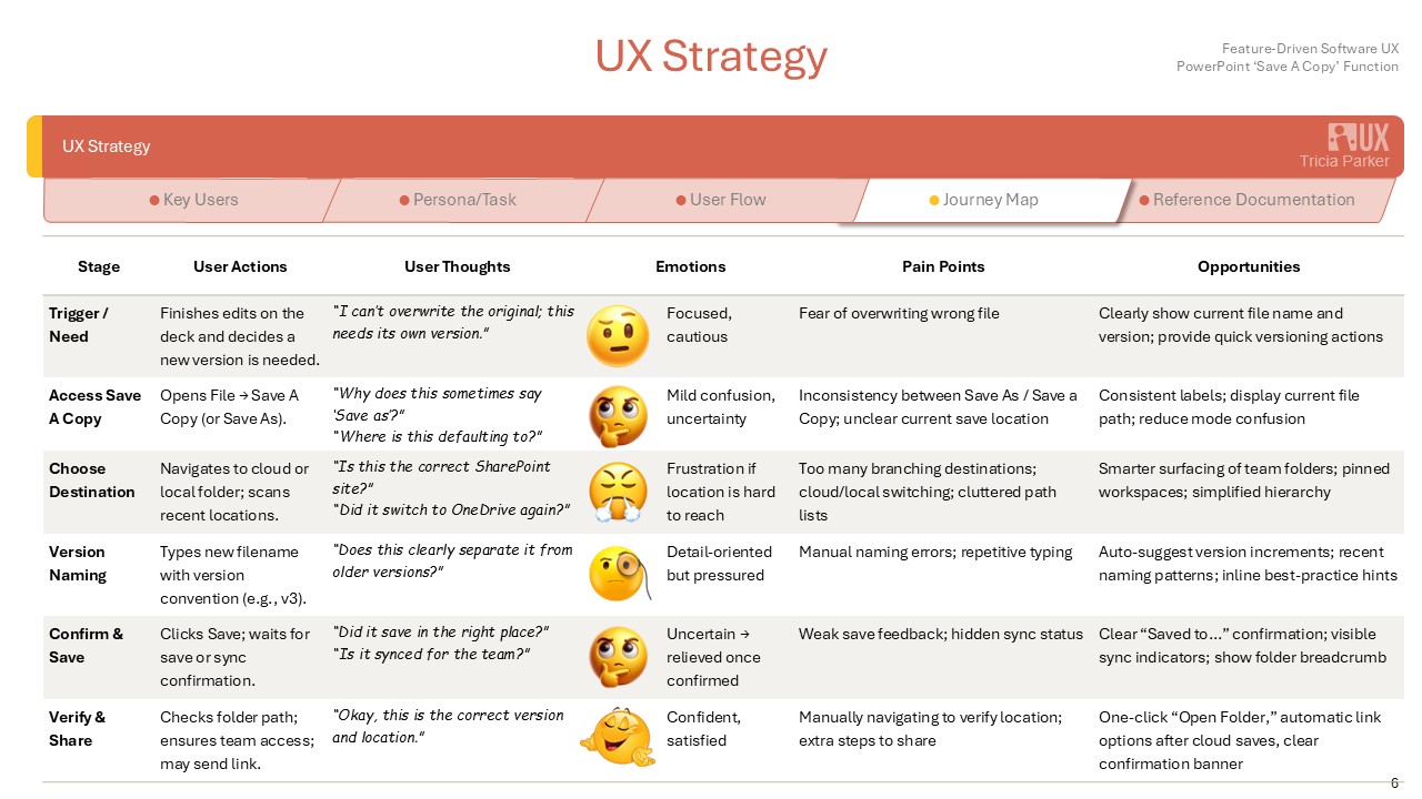
In a fast-paced business environment, it's essential for standard processes to be straightforward. Any unnecessary steps required or tasks that make the user stop to ponder should be streamlined.
The most common user need, chosing a save location, is buried behind <More Options> link, creating unneccessary steps and slowing workflow.
Mismatch between mental model and expected UI flow. Users expect <Save As> to appear immediately, but instead are pushed into a compact sidebar UI that feels disconnected from the familiar file explorer behavior.
Inconsistent placement of controls. The path to browse folders is visually minimized and not aligned with Microsoft's standard file-saving patterns, causing hesitation and repeated misclicks.
Ideation Concepts
Usability Study
Following the initial ideation concepts, a moderated usability study was conducted to evaluate how effectively users understood and navigated the <Save As> redesign options. The goal was to validate whether the proposed solutions reduced friction, supported user expectations and improved overall task efficiency.
Study Type
Participants
Simulated
5 participants
• Project Manager
• High School Teacher
• Marketing Specialist
• VP of Operations
• College Student
All reported saving multiple files per day and relying heavily on folder organization.
Participants completed the following tasks using interactive mockups:
- Save a new file to a custom folder
- Save a versioned copy of an existing file
- Switch between local and cloud save destinations
- Use quick-access folder shortcuts
Sessions were recorded and observed for
- Time on task
- Errors
- Navigation patterns
- Verbalized frustrations or positive cues
- Overall task confidence
Feedback was collected through post-task interviews and a satisfaction survey.
Key Findings
1. Unified Save Dialog Eliminated Confusion
All participants preferred the unified <Save> dialog that opened immediately after selecting <Save As>.
Result: 5/5 participants completed the task fast and with fewer navigation attempts.
"This is how it should work by default. No hunting for the real Save windows."
2. Removal of <More Options> Increased Efficiency
Users no longer hesitated or questioned where to click.
Result: Average task completion time improved by 27%.
<More Options> had previously been interpreted as advanced settings, not a main action.
3. Quick-Access Locations Reduced Cognitive Loads
Participants relied heavily upon Last-used folder, Favorites, Project folders, Local v Cloud labels.
Result: 4/5 participants said the quick-access panel made saving "more predictable".
Reducing steps to familiar locations lowers cognitive load and keeps users focused on the task at hand.
4. Cloud v Local Saving Clarity Improved
Clear labelling of "OneDrive", "SharePoint" and "This PC" signtificantly reduced mis-saves to cloud drives.
Result: Errors dropped from an average of 2 per session to 0 in the redesigned flow.
A simple distinction between cloud and local removes the continual save to Desktop method, keeping files better organized.
5. Auto-Versioning Prevents Loss and Builds Confidence
Auto-versioning creates a safety net for users by capturing file history without requiring any action. It reduces the fear of overwriting and supports effortless rollback, and ensures that users can experiment freely.
Result: Overwrites and file loss reduced significantly.
"Auto-versioning was much easier than having to remember to put a new date after every single file name. Also cleaned up my folders!"
Impact on Design Decisions
Included in Final Prototype
- Unified <Save> Dialog
- Left-handed quick-access panel
- Clear cloud/local hierarchy
- File browser available immediately
- Auto-suggest versioning
Not Included (based on user feedback)
- Overly automated <smart save> behavior (felt unpredictable)
- Removing manual access to nested folders
- Cloud-first defaults without explicit user selection