HEURISTIC UX EVALUATION
Space & Rocket Center Website
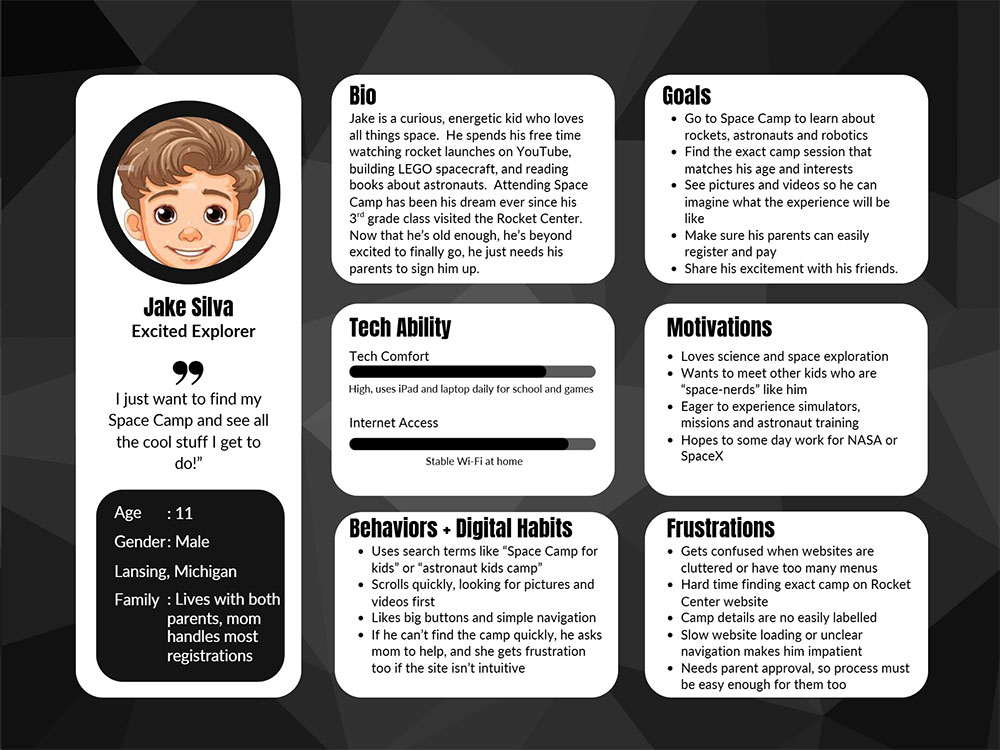
Jake's Space Dream
Ever since he built his first cardboard rocket in the backyard, Jake has dreamed of blasting off into space. When he heard about Space and Rocket Center, he sprinted to the website, scrolling excitedly until he found the perfect program and begged his parents to buy his ticket right there and then. Now he's counting down the days like a launch timer, ready for his mission to begin!
Membership to the Moon - Maya's Story
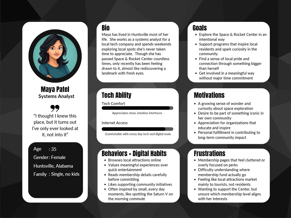
Maya, a lifelong Huntsville resident, had driven past the Space & Rocket Center countless times, always catching a glimpse of the Saturn V above the treetops. Today, something shifted—a spark of curiosity made Maya realize how much she’d taken the center for granted. Later, at home, Maya found herself browsing the Space Center’s website. The membership page caught Maya's eye, not for the perks, but for the chance to be part of something bigger happening right in her backyard. Suddenly, the Space & Rocket Center felt less like a tourist stop and more like a gateway Maya had overlooked. As Maya scrolled through the programs, one event leapt off the screen: the “Cosmos and Cocktails” planetarium show. The idea of sipping a drink beneath swirling galaxies and mingling with fellow space enthusiasts felt electric—a blend of wonder and connection. Suddenly, the possibilities seemed endless, and Maya could almost taste the excitement of discovering the universe in a whole new way. The idea made Maya smile, space exploration wasn’t just a distant dream; it could start right here, at home.
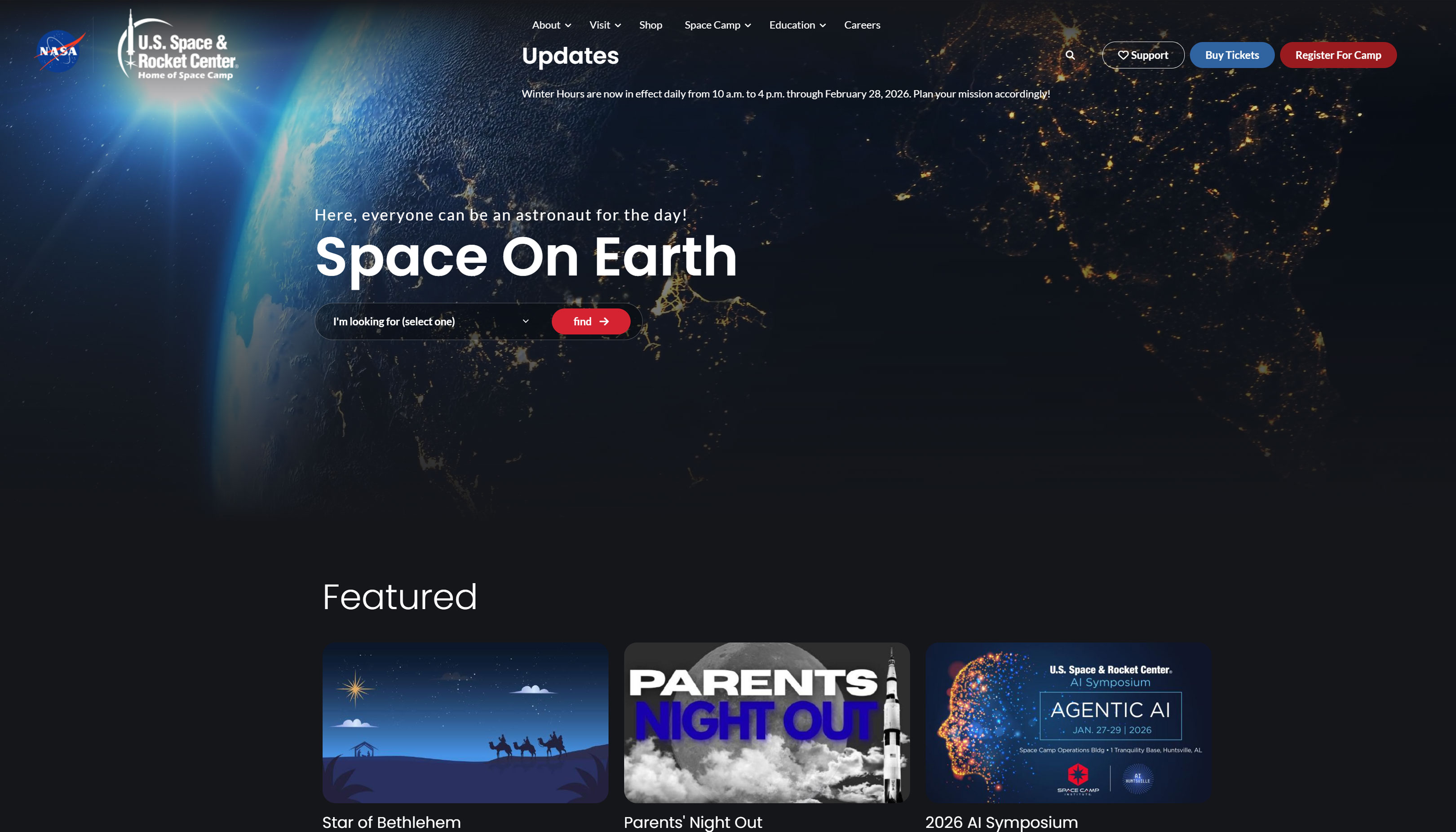
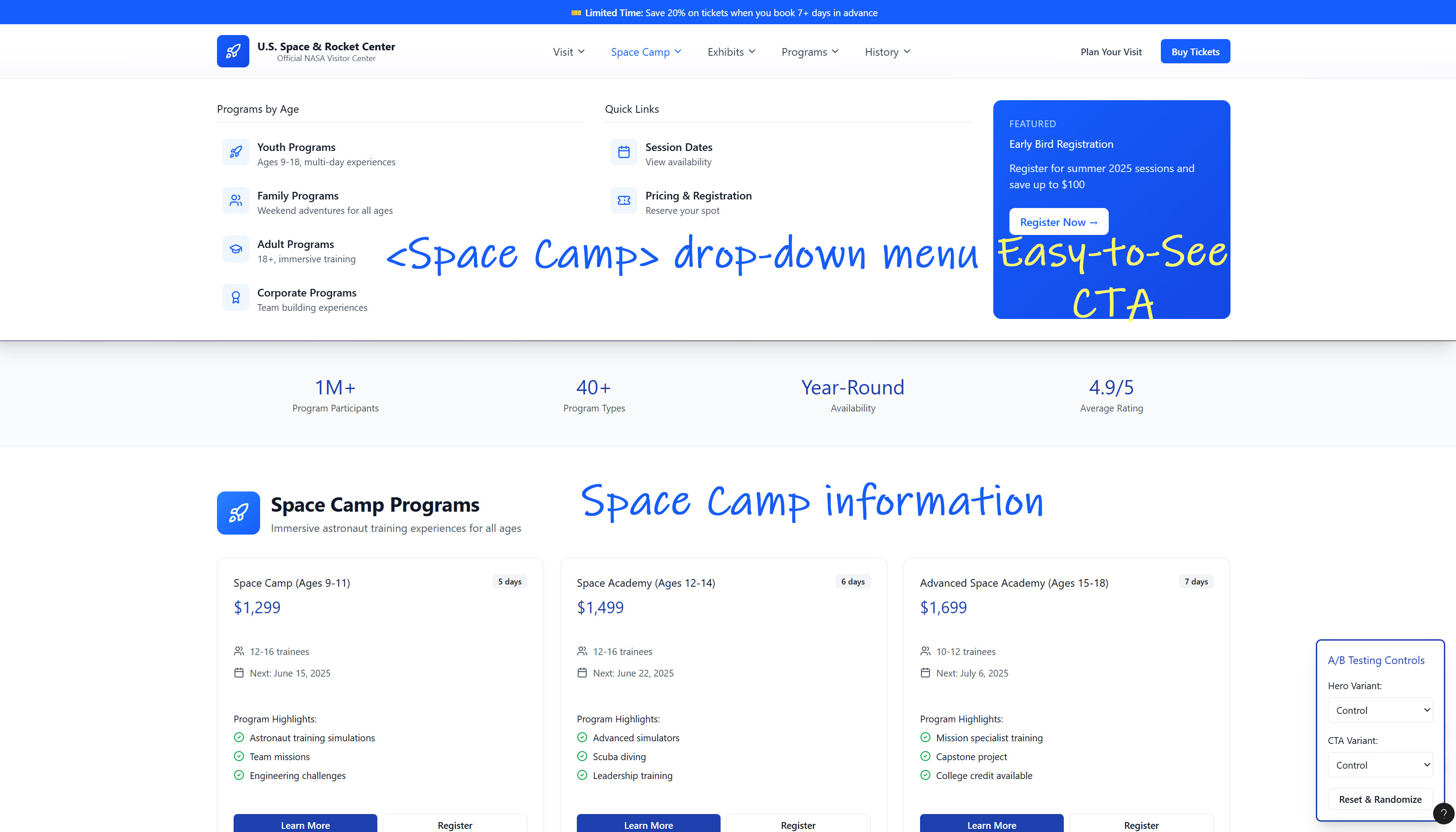
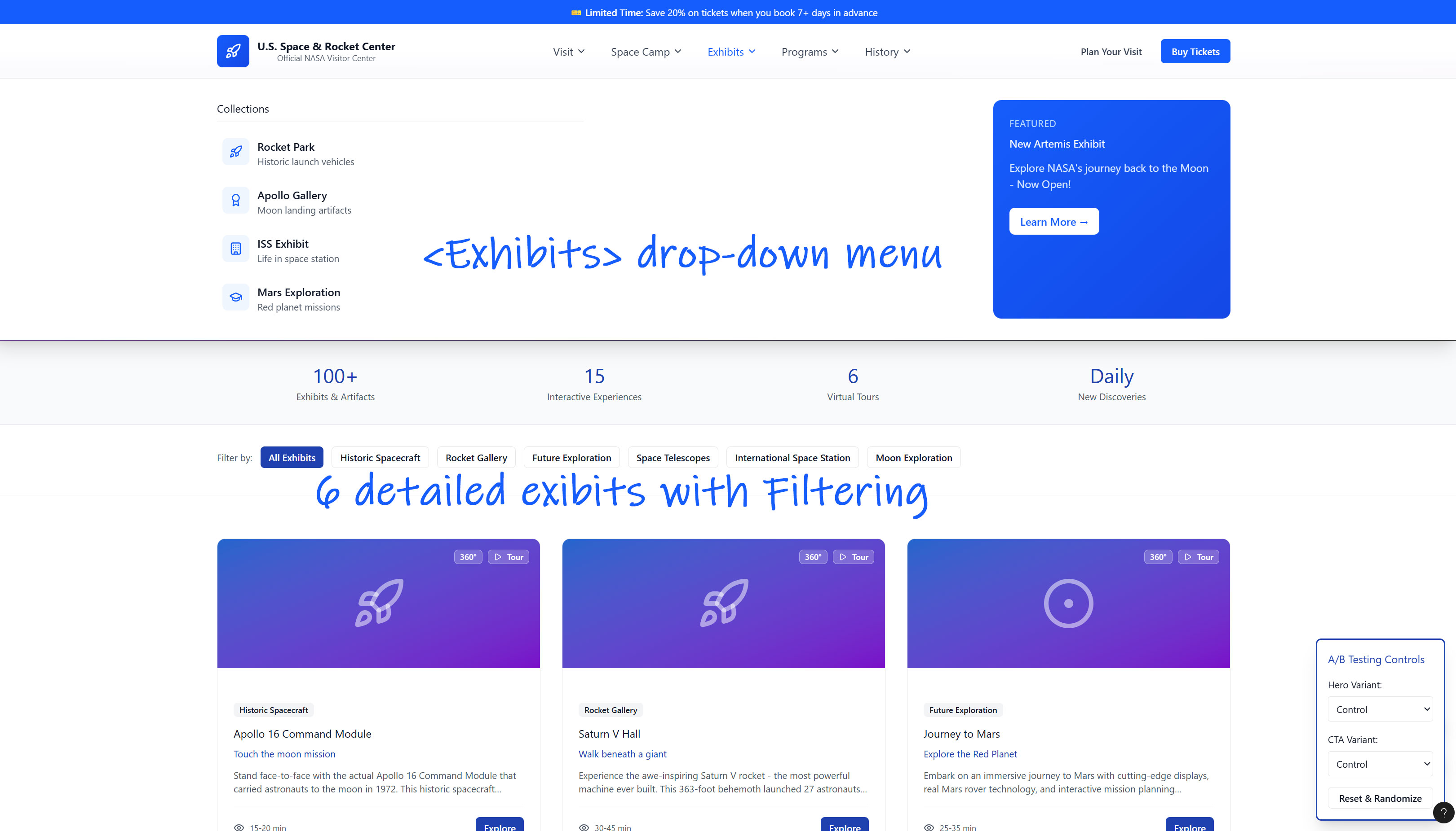
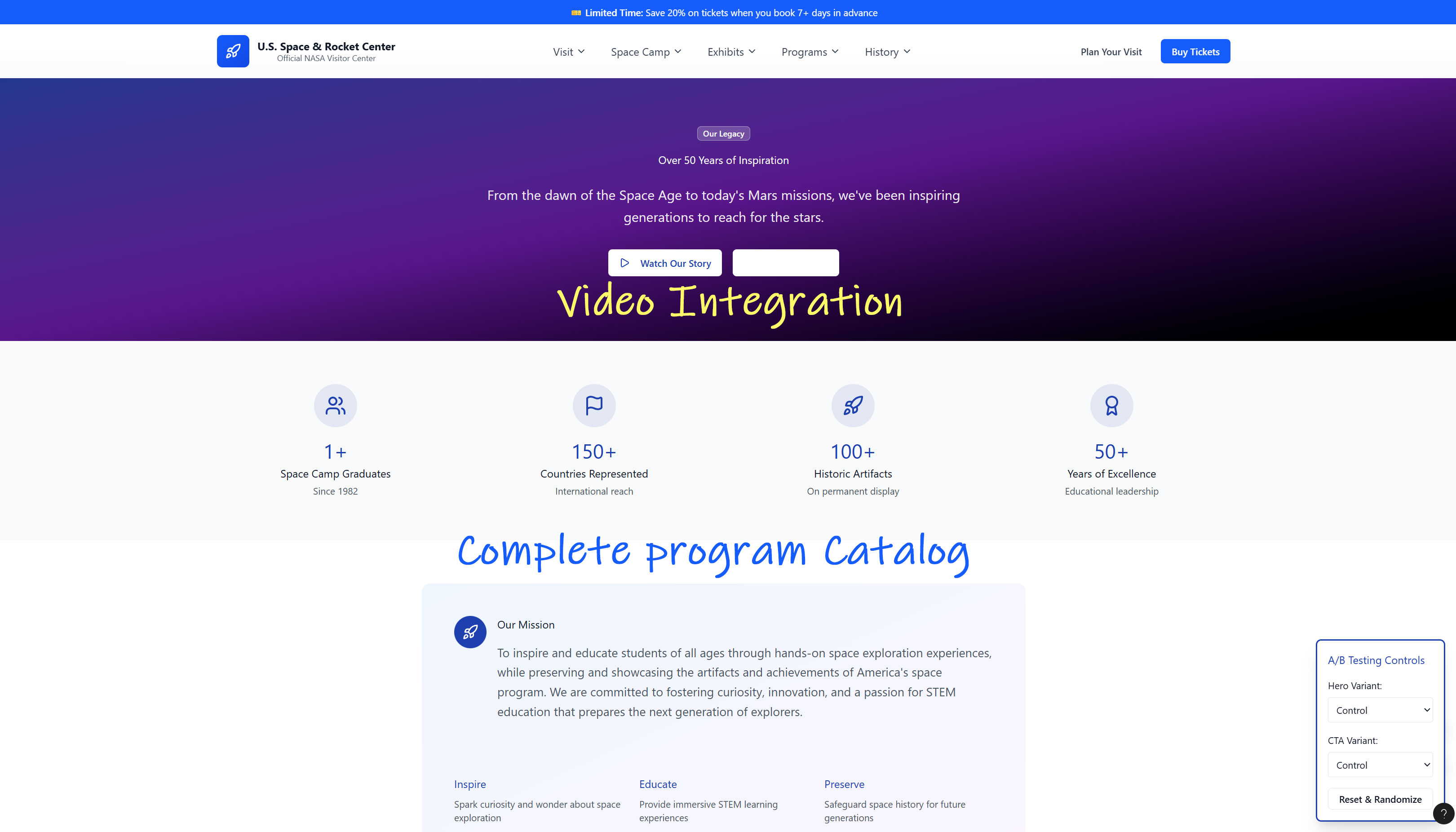
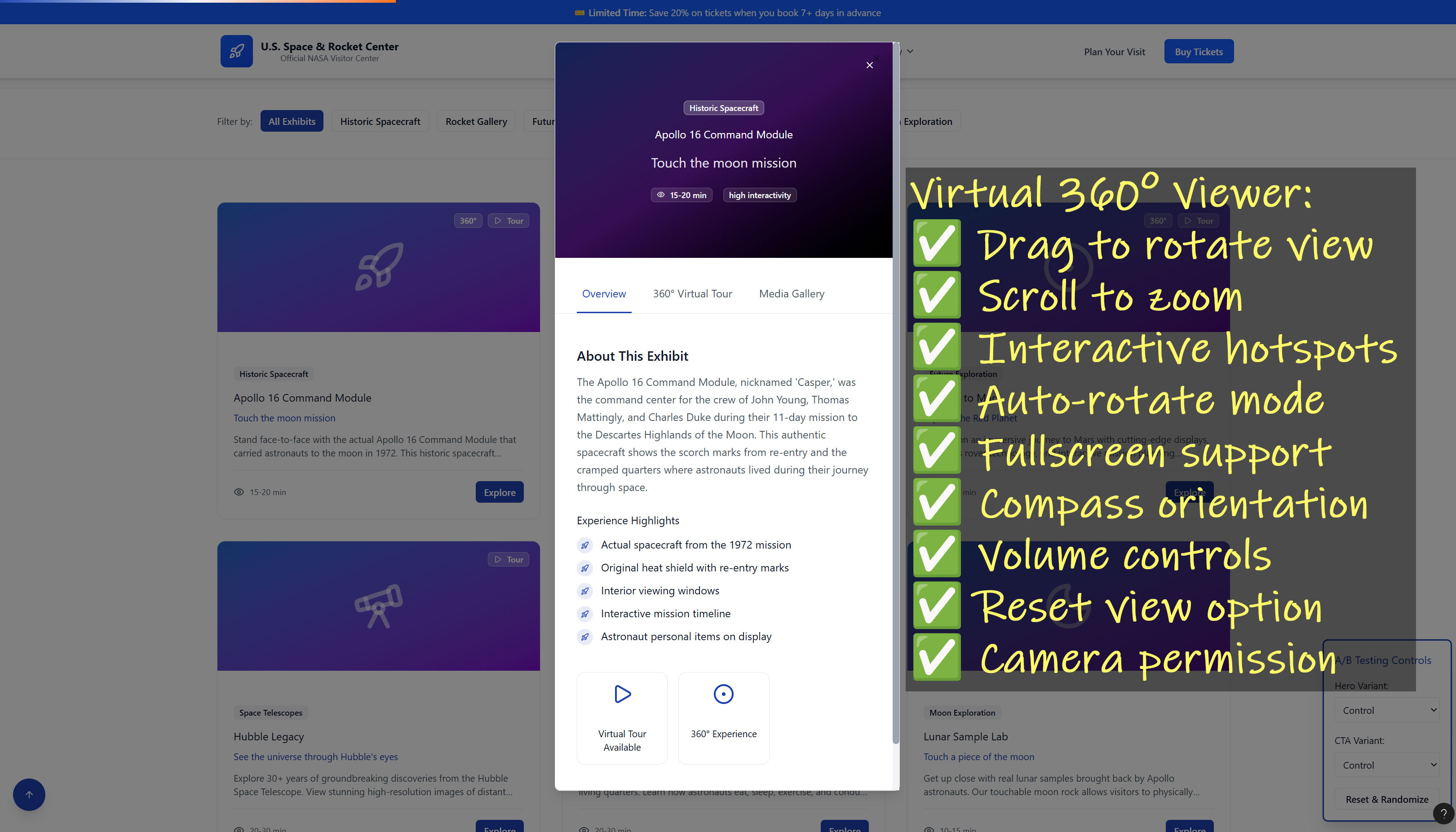
The U.S. Space and Rocket Center website is an informative hub for exploring exhibits, planning visitors, booking Space Camp programs and accessing essential visitor information.
This heuristic evaluation is a cost-effective expert-driven method to find usability issues, prioritize fixes and improve user experience without the overhead of full-scale user testing. This evaluation will make the site more intuitive, efficient and user-friendly, which can lead to better engagement, fewer errors and higher satisfaction.
UX Audit
Assessment Type
Heuristic Expert Review
Perspective
UX Strategy, Interaction Design, Conversion Optimization
Goal
Identify usability problems, friction points, and opportunities for clarity, engagement and conversion.
Executive Summary
The current digital experience does not fully support ticket sales, Space Camp registrations, or visitor engagement.
Users experience friction due to unclear hierarchy, dated design, and information overload.
A phased roadmap will deliver immediate wins and long-term transformation.
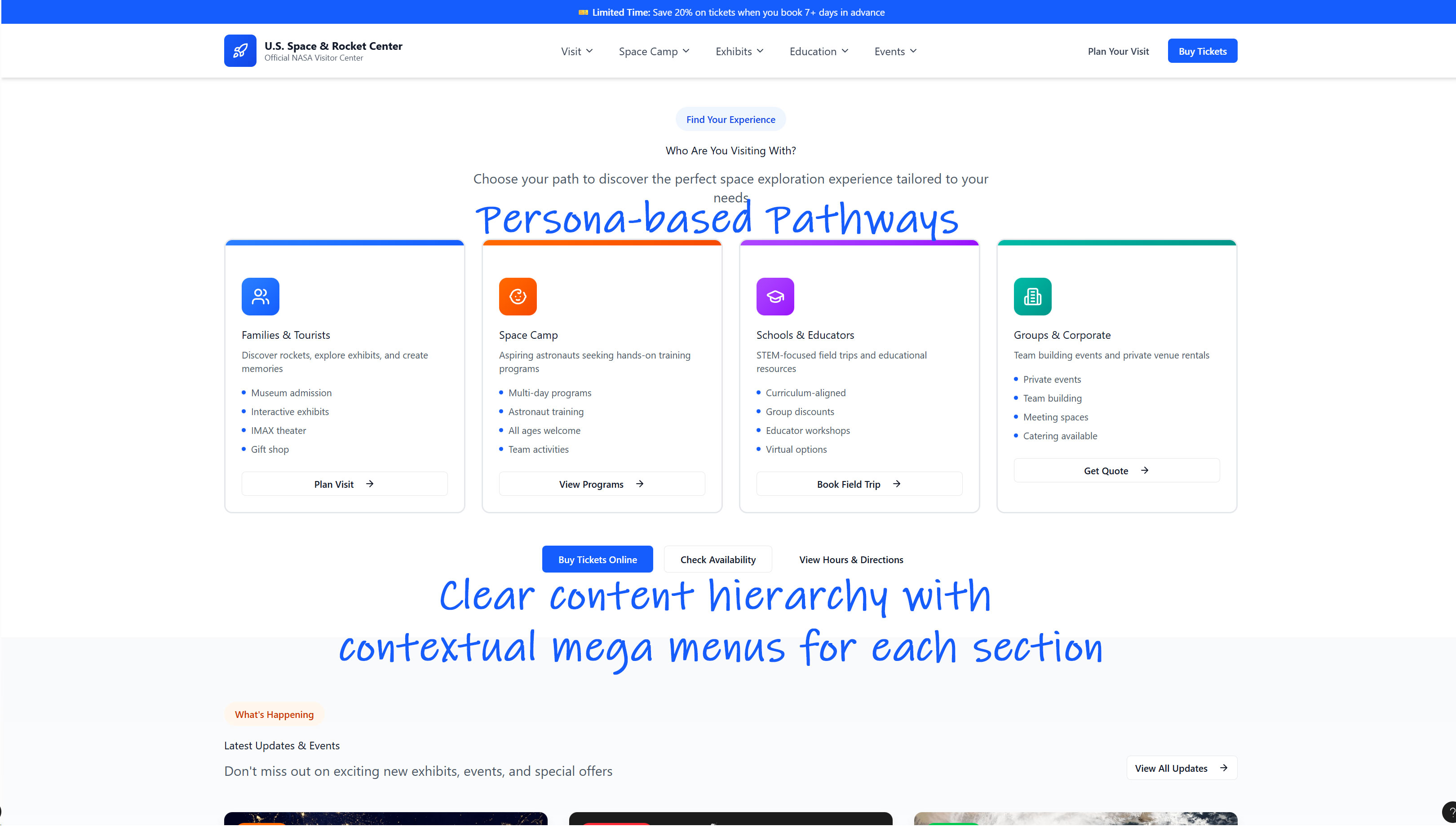
Primary User Types
“I want to buy tickets and plan my trip.”
Needs: ticket info, hours, parking, exhibits, special events.
“I want to register my child (or myself) for Space Camp.”
Needs: camp types, pricing, date availability, booking process.
“I want to attend events or become a member.”
Needs: membership information, event information by category and/or date.
“I’m looking for group programs or field trips.”
Needs: group rates, space camp info, accomodations information.
The persona-related issue is the landing page does not tailor content or pathways to these groups clearly or efficiently.
All information for all groups is shown at once.
The Problem
Upon landing on the Space & Rocket Center homepage, here are some of the key UX problems/friction points.
Why this Matters from a UX Perspective
User Drop-Off
Without a clear "next step", users may leave before buying tickets or registering for camp.
Confusion for Different User Groups
Tourists, parents, and educators all come with different goals, the design doesn't strongly guide each persona.
Preceived Credibility Risk
A dated or cluttered design reduces trust, especially for a science installation.
Lost Conversions
Key actions (tickets, camps) may not convert well because CTAs are not prioritized.
Strategic Goals
From a UX standpoint, the homepage tries to do too much at once, making it unclear what the user's primary action should be. The design doesn't emotionally or visually engage users in a way that aligns with the wonder of space exploration. By clarifying goals, updating visual design and simplifying navigation (CTAs), the site could great improve its effectiveness, especially for conversion of sales and user satisfaction.
Prioritized Redesign UX Roadmap
Current Site
PHASE 1 - Immediate Wins
Timeline: 0-4 weeks
Purpose: Reduce friction now and boost conversions without heavy engineering


Primary:
- Buy Tickets
Secondary:
- Space Camp
- Plan Your Visit
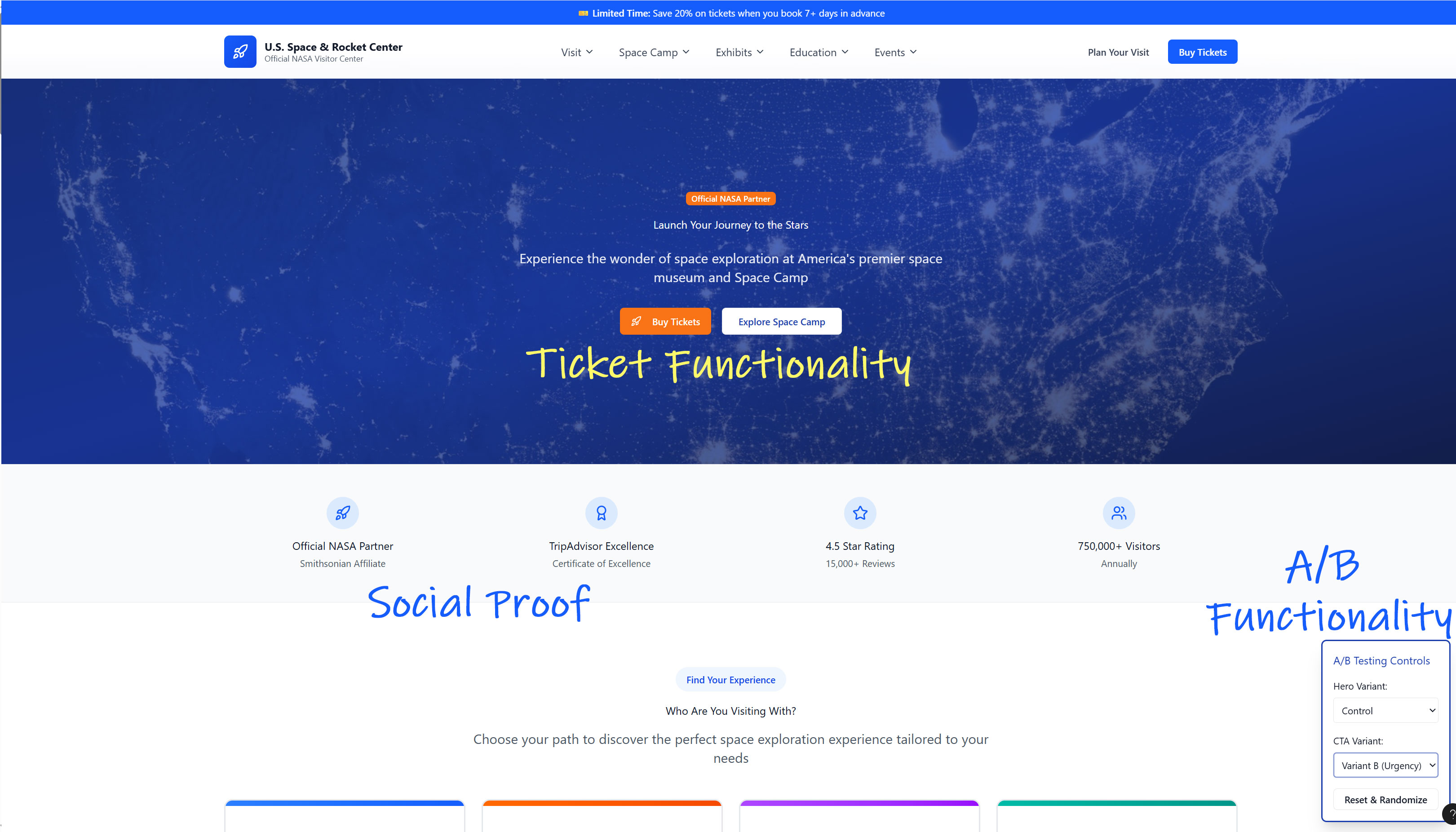
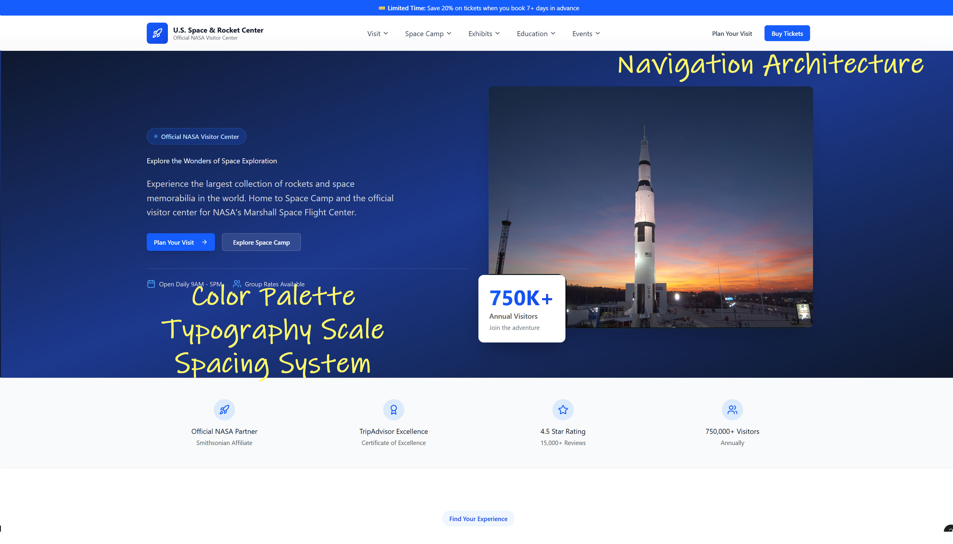
Add a high-impact static hero image (rocket, astronaut, camp training).
Buttons:
- Buy Tickets
- Space Camp
Increases conversions across all pages immediately.
Break dense text into cards
- Visit
- Camps
- Exhibits
- Events
Add headings and spacing to reduce cognitive load.
Place NASA/affiliate badges and “# of visitors yearly” or “Since 1982” in the hero or just below it.
Add links to Social Media accounts.
Rename ambiguous nav items to clearer ones
- Exhibits
- Tickets
- Camps
- Events
Immediate Wins
PHASE 2 - UX Foundation
Timeline: 4-12 weeks
Purpose: Establish strong information architecture and design consistency.

Conduct a quick card sort with:
- Tourists
- Parents
- Camp attendees/alumni
- Educators
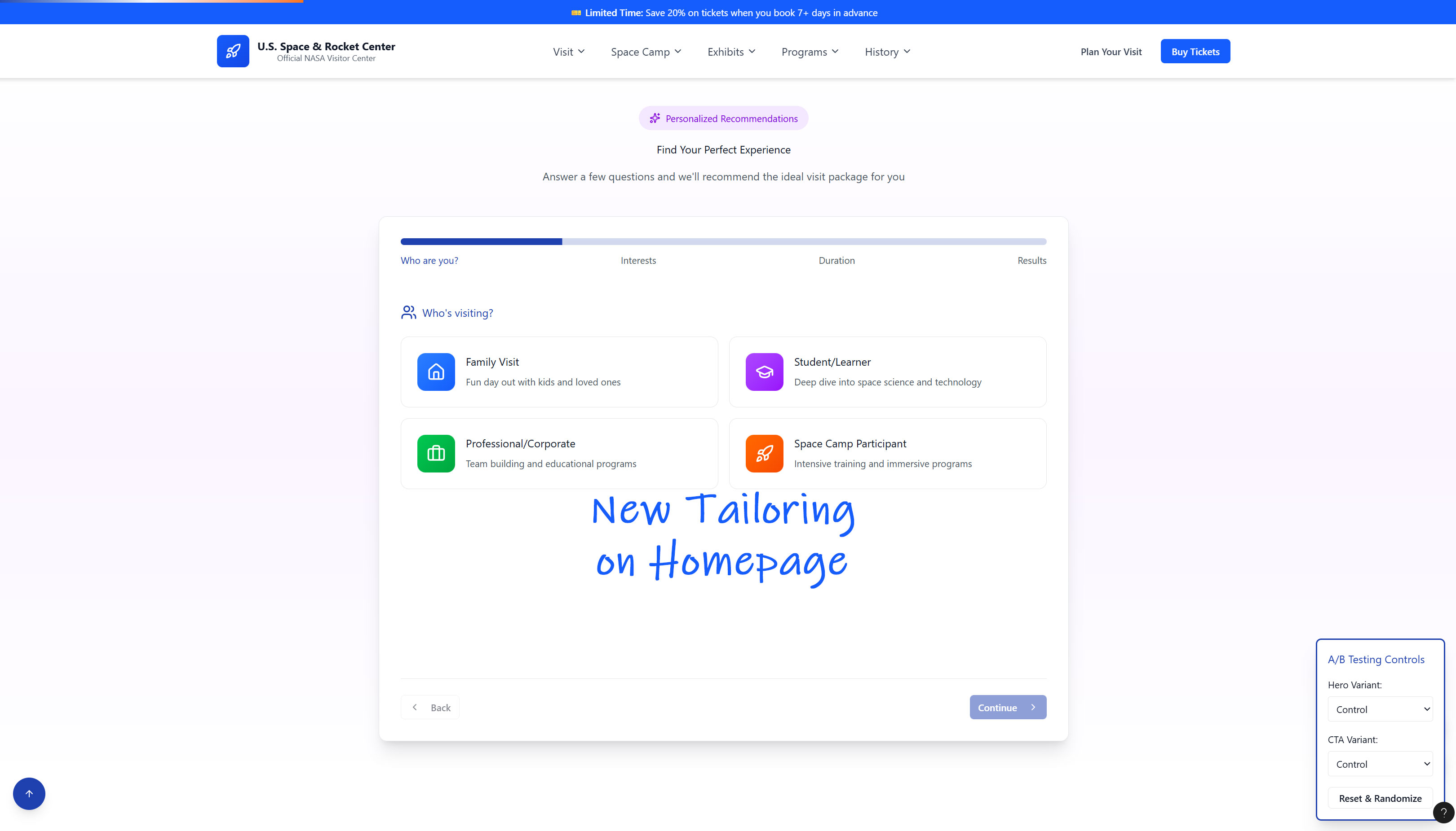
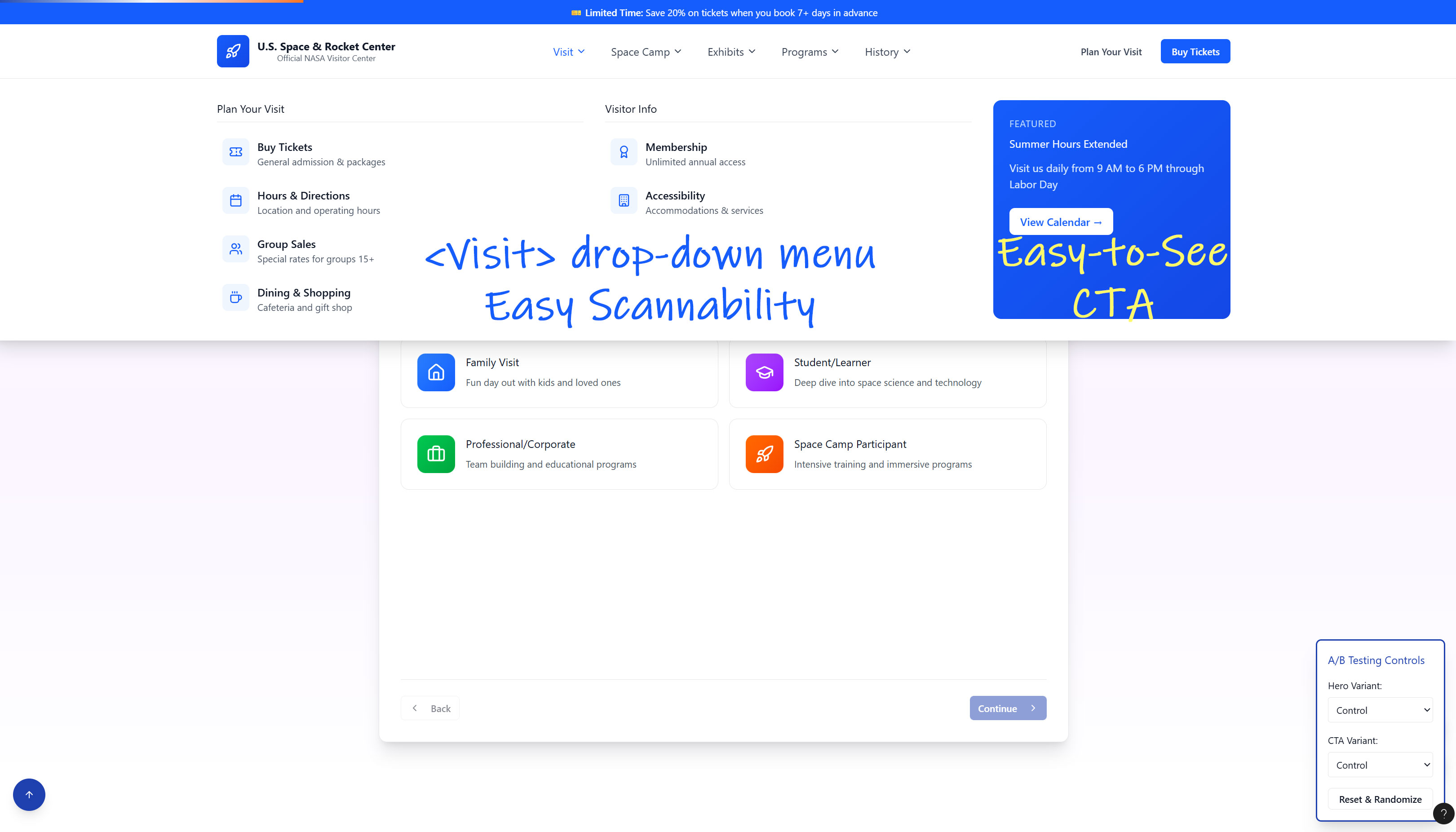
Create a simplified, persona-aligned menu:
- Visit (tickets, hours, parking, exhibits)
- Space Camp (types, dates, pricing)
- Programs (school groups, field trips)
- Events
- Support / Membership
Updated typography
Modernized NASA-adjacent color palette
Standardized button styles
Consistent components for cards, lists, CTAs, hero blocks
Persona-based paths (cards or “I am a…” selector)
Visual storytelling: video or photo strip
Clear section hierarchy:
- Visit
- Camps
- Exhibits
- Events
- Membership
- Testimonials
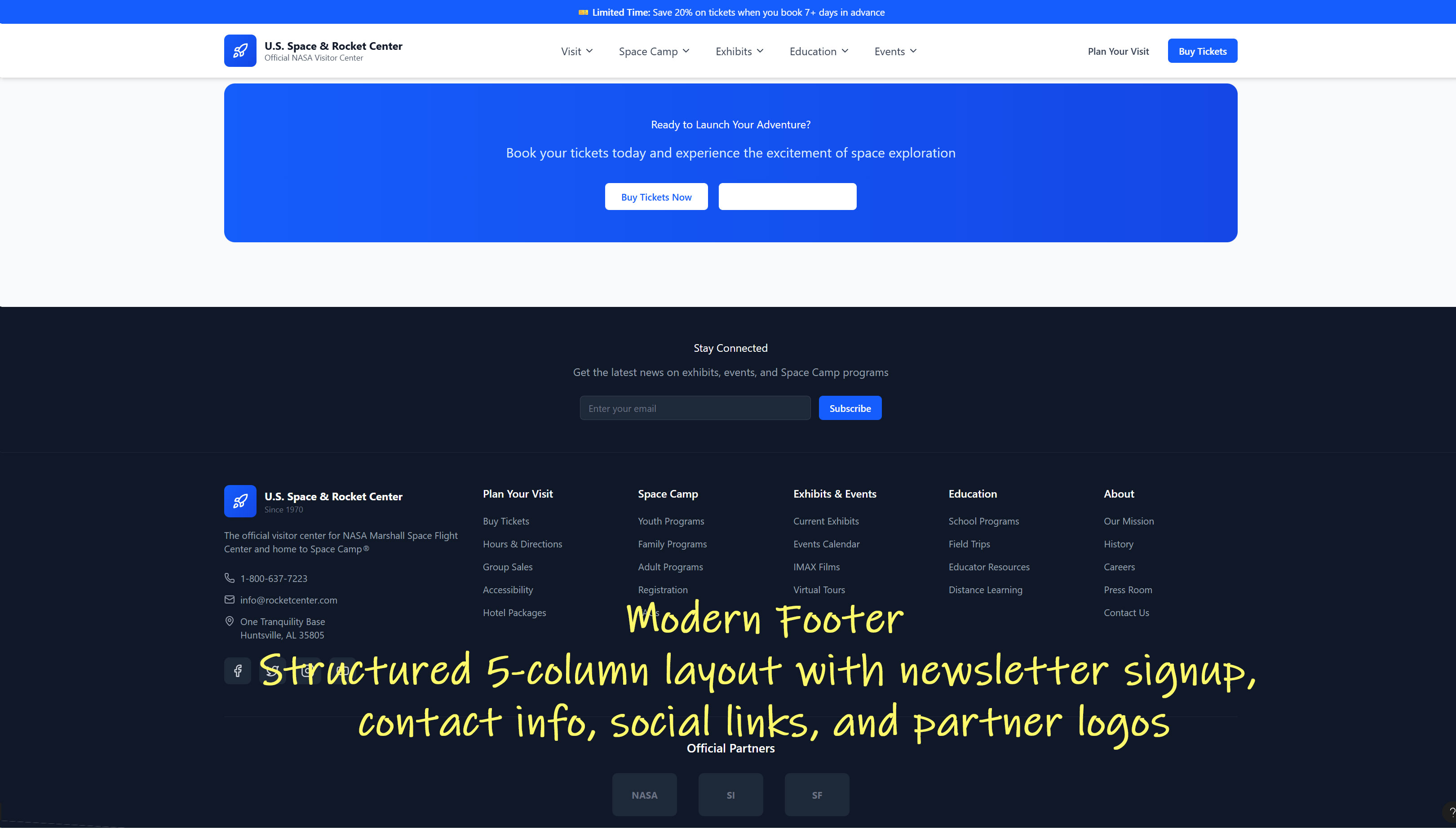
Add sitemap links
Add membership/donation links
Include social media and email signup
UX Foundations
PHASE 3 - Conversion Optimization
Timeline: 12-20 weeks
Purpose: Improve Space Camp and ticket purchase funnels.


Streamlined steps:
Home → Tickets → Visit Type → Select Date → Checkout
Improve readability and reduce decision friction.
Replace “wall of camp options” with a guided selector:
- Select age
- Select interest (aviation, robotics, space)
- Compare camps
- See next available dates
Video testimonials “Campers come from 50+ countries”
Photos of kids in simulators
Press mentions in carousel
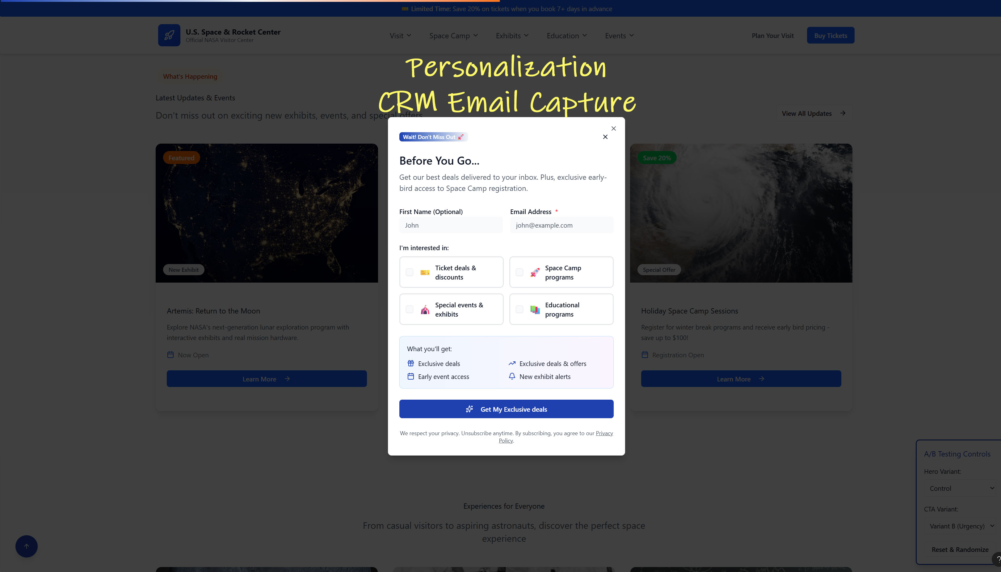
Test CTA wording (“Buy Tickets” vs “Plan Your Visit”)
Test static vs video hero
Test segmented persona-guided homepage
Conversion Optimization


PHASE 4 - Advanced Enhancements
Timeline: 20-36 weeks
Purpose: Add deeper functionality, personalization, and engagement.

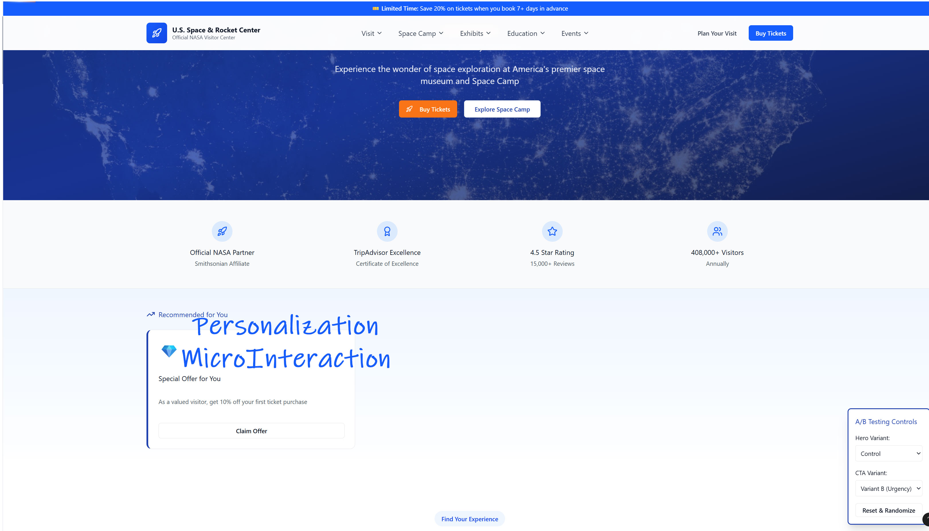
Dynamic homepage sections based on user type (tourist vs parent vs educator)
“Welcome back” features for repeat visitors.
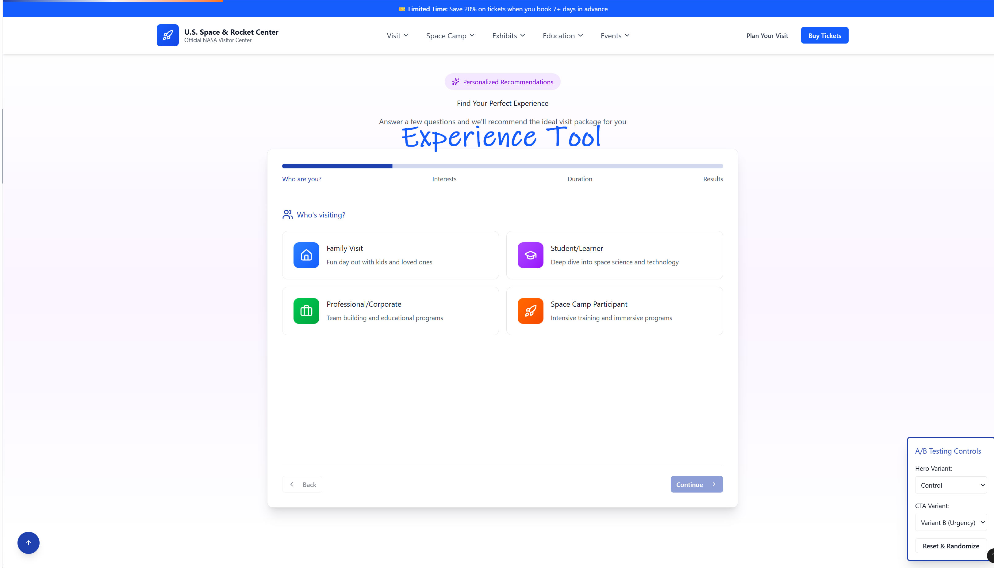
Interactive recommendation tool for:
- Exhibits
- Space Camp
- Museum events
This will increase engagement and reduce confusion
Hover animations
Button feedback
Small iconography details
Enhance modern, credible feel
Pop-ups for special events
Newsletter tied to space launches, astronomy
STEM events
Advanced Enhancements
PHASE 5 - Long-Term Evolution
Timeline: 6 months-1 year
Purpose:Future-proof the site and grow digital influence.
Exhibits pages
Museum history
Food & amenities
Group visits
Support/donations
Space exploration timelines Astronaut partnerships
Training simulators explained Virtual tours or VR content
Quarterly UX reviews
Heatmap analysis
Mobile-first refinements
SEO + UX hybrid improvements
Long Term Evolution
Expected Outcomes
Expected outcomes should promote:
- Higher ticket purchase conversion.
- Increased Space Camp enrollment.
- Reduced user confusion & abandonment.
- Stronger brand credibility.
- More engaging, inspiring visitor experience.
Final Recommendation
Begin with Phase 1 immediate for fast wins.
- Start information architecture and design system work in parallel.
- Use A/B testing and analytics to guide optimization.